
AiFlux
What happens when a global technology firm and a global energy business join forces? The answer: Digital transformation for energy leaders. We helped AiFlux™ define their story, build their brand, and clarify what makes them unique.


What’s in a name?
AiFlux stands for Assets in Flux. They create intuitive technology platforms that empower energy leaders to unlock the true value of their heavy assets, eliminate waste, and power our world. They’re helping an entire industry transform digitally.
Brand Promise/Tagline
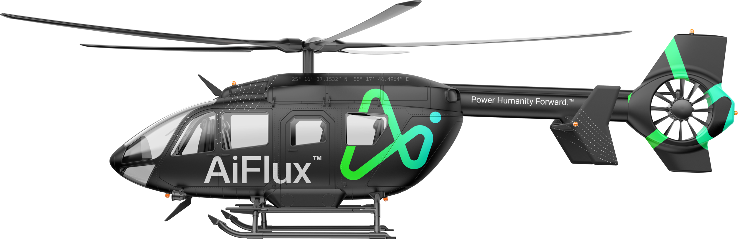
Power Humanity Forward
Power
Gives the industry an imperative and a mission to move towards that resonates with energy leaders. This also speaks to the nature of the energy industry and represents all kinds of energy.
Humanity
Connects to the narrative of Ai not replacing people, but empowering them. This also promises their target audience a WHY that’s bigger than tech or industry. It’s about people.
Forward
Digital transformation is about moving forward, innovation, and the urgency to change now before it’s too late. AiFlux is passionate about helping these energy leaders transform digitally and the word “Forward” brings that to life.
Color Palette
The AiFlux color palette is all about energy and empathy. Energy, because it’s bright, vibrant, and stands out from their competition in a compelling way. The palette is also empathetic in that energy workers are used to seeing and wearing neon safety colors day in and day out on their rigs and job sites.


Humanity First
Industries have a lot of fear around digital transformation. Many see it as robots and Ai coming in and replacing jobs that people actually need. It was important to AiFlux that we position their brand not as one that replaces the humans who make the energy industry what it is, but one that empowers those humans instead. This was a key piece of insight in crafting their brand story.


A logo doesn’t sell (directly), it identifies.
Paul Rand

5 keys to a great logo design.
A great logo must be memorable, distinct, scalable, appropriate, and timeless.
At Forrest, the foundation for everything we build is storytelling. So when designing a logo for B2B firms, we always mine for the visual narrative that’s unique to the brand.

In this case, AiFlux’s unique story is that everything they do involves change, energy, and movement. Finding that visual narrative through hundreds of sketches, iterations, and concepts, is what set us up to be able to create a brand identity that hit all 5 markers of great logo design.

I have been doing this for a long time, and I have never seen anyone bring a business vision, story, or who they are to life in such a way. We are really impressed and really excited about our brand identity.”
Hani, CEO
AiFlux
Logo animation
The cherry on top for any visual identity is animating the logo for a video bumper. This brings the logo to life and took the concept of “motion” to the next level.
AiFlux Brand Guide


Work with us
We had a blast building a brand from the ground up with AiFlux. We’re passionate about helping B2B leaders like you to put humanity back in businesses through things like branding. We’d love to walk you through some more details from this project, or talk about the vision you have for your brand.
Send us an email and we’ll set up a time to chat.